Nothing makes you more aware of how quickly time flies than watching your children grow. I cannot believe my oldest enters high school this fall. All this lamenting had me thinking of the first days with him in our lives, our home and his little nest. (I just might post picture of that little nest one day.) It also had me thinking of a space I did for a client's baby boy, who is now turning TWO. I feel like I did it yesterday. So here it is.
My client had fallen in love with a vintage cowboy fabric. I died when she showed me the swatch; it was the same exact fabric I'd used in my son's room 13 years earlier, but in aqua instead of navy. Somehow updating a fabric I'd personally grown tired of was a challenge. But I actually loved it all over again. It definitely had that "classic baby boy feel" she wanted. I decided to freshen it up with some Jonathan Adler accessories and lighter colors.
So I spent a long day shopping on Montana Ave. in Santa Monica, one of my favorite streets for fab finds and great lunches. I ducked into Jonathan Adler's boutique and here's what I found...
Loved this!! But the price tag and impracticality of it would eventually lose to a solid wood table and chairs.
Loved this witty little guy too... But didn't feel he had the legs to get to the teen years.
Ageless, timeless, and totally chic. Wrap it up so I can trim it with aqua French grosgrain please.
This took some convincing. But sometimes a designer has to fight the good fight. I did it in this beautiful soft blue (below). Worth the lead time and every penny.
Then I found a few items to give it that "classic/vintage" baby feel I knew my client wanted.
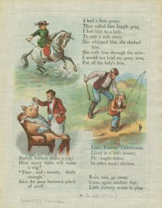
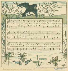
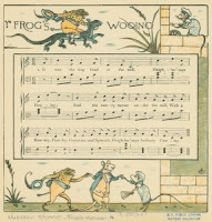
I found all these inexpensive prints, unframed, in a vintage illustrations shop. I thought I'd use a collection over the crib (fitted with acrylic and hard screwed into the wall studs!) and the music sheets would be perfect for the bathroom.
Befores
 Here's the bath, with it's odd mirror configuration, 'honey oak' cabinets and Xanadu light. The countertops were fine and the cabinetry was good quality. It just needed a fresh coat of lacquer and new hardware.
The plantation shutters and chocolate brown carpet were brand new, so both had to stay. Since the carpet was 100% wool and a dark color, it was both baby-heathy and baby-proof. The only other stipulation my clients had was that space be "very classic, yet updated, definitely not at all trendy." They also asked me to squeeze whatever I could from the budget to freshen up the bathroom--much needed! (Check out those corner medicine cabinets. I'm dumfounded that such hideous things are mass-produced.)

Here's my board
and my sketches
And here are the lovely Afters...
With new hardware, lighting and medicine cabinets (all Restoration Hardware), as well as some white lacquer and fresh wall color, we gave the bath a much need facelift.
These music book illustrations were much appreciated by the musical father and older brother. More importantly, their parchment background blended with the warm countertop, making a finish I hated look rich and intentional! Love that when you're on a tight budget.
Can't believe that little guy is now brushing his teeth at this very sink. It definitely flies by. All we can do is give them roots and wings, and hopefully a nice little nest they'll always call home.


No comments:
Post a Comment
Please, tell me what you think. And share this on facebook!