Tuesday, December 11, 2012

Pottery Barn Holiday Photo Shoot


If you're like me (and you must be if you're here), you swoon over catalog images at Christmas. Well, now you too can have a magical entry. All you need is this great how-to video, an historic gem and a crew of about 80. Looks like lots of work, but tons of fun!


For more (realistic) holiday inspiration, check out my Merry Christmas pinterest board. Lots of great ideas for kids' crafts, table settings and easy recipes! No crew required.

Enjoy the season!


Tuesday, December 4, 2012

Design Soulmate-Mark D. Sikes

Ever see a shelter spread and think, "Wait, is that my house?" Whether it's the house of your dreams or your reality. That's exactly how I felt when I saw this Lonny spread. Jennifer at Belclairehouse, felt the same way I did. She called it "decorating soulmates." Behold the work of Mark D. Sikes ...

For months I've had this dining room shot (along with many others of his) on boards behind my desk. I love it more every day. I actually just discovered that I've had much of his work pinned in boards and didn't know it was his. Funny to see the same spaces shot by different photographers, isn't it. Really shows you how crucial light is to the overall essence of a space.

The whole space is filled with all the things I love: Blue and White pottery, French check--especially in camel and cream, chinoiserie, and lots and lots of greenery! A must.

This is exactly how I used to accessorize my giant island in our old house. Blue and white + herb topiaries. (My hurricanes were a ZGallerie steal. I bought out the entire stock.)


Mark D. Sikes Interior Design
Okay, anti-brass client who shall remained unnamed, this shot is bringing my heart back to the polished nickel. Mark is clearly a big fan of Mr. Michael S. Smith, as am I. As is anyone and everyone, I suppose.

Mark D. Sikes Interior Design

And (real-world) friends, doesn't this remind you of my garden? Black and white striped fabrics, boxwoods and white icebergs. Nothing unique, I know. But why reinvent the classics? I think my soulmate Mark D. Sikes would agree.

Friday, October 26, 2012

Brand New England

Like everyone else these days, I love New England style homes, whether they're in California beach towns, Napa wine countryor Midwestern plains. But I personally like to blend the clean, classic look with unexpected elements of modern, French or even BaroqueI encourage clients to use salvaged or modern light fixtures here and there, hang a gilded Chinoiserie mirror over a contemporary sideboard  or paint at least some millwork a color other than white (like the teal lacquered library I'm rendering tonight!). Blended, eclectic interiors are so much more expressive, more interesting and, like all spaces done well, age better.

Tonight I happened upon this Interiors spread by Westport designer Lynne Scalo. I was blown over by her super fresh, eclectic take on New England style. I think you will be too.


Happy Weekend!


Sources: Interiors

Friday, October 19, 2012

Little Black with Your Coffee


I'm usually one for light, bright decor in a breakfast area, but I love the touches of black in these breakfast rooms; black fabrics, rugs, lampshades, even walls. I might even start taking my coffee black.

Mar/Apr 2011
Antique mirror set in black lacquer mullions makes this such a rich space. Even the floor is black lacquer.

Mar/Apr 2011
Love the combination of black with those copper light fixtures.

Mar/Apr 2011
It's hard to tell in this photo, but that rug and the wallpaper are actually black. Black and emerald green is such a classic combo and trending hard right now. For more of this look, click here.

Mar/Apr 2011
This room would sure wake you up.

Dec/Jan 2010
Just a touch of black adds a little contrast here...

Dec 2010
and a lot of contrast here.

Aug/Sep 2010
For the moodier morning people.

Jan/Feb 2011
Okay, so this is more of a dining room, but it's one of my favorites. I love the way this black rug grounds this crisp white room. Same for the shades on those emerald porcelain lamps. To order that fabulous light fixture, or any products you like on these pages, just shoot us an email.

Wednesday, October 10, 2012

Expert Advice

You know how much I admire Charlotte Moss, not only as a designer and incredibly astute business person, but as a woman of strong character. The more I learn about her, the more I put her on the shelf with Diana Vreeland, Elsie de Wolfe, and Diane von Furstenburg – all strong, fearless women with even stronger aesthetic visions.  I was delighted to read Charlotte Moss' "Tips for Living with Style and Self-Confidence" in the latest, delicious issue of Lonny.

My favorite tip, Listen to yourself and don't solicit the opinions of others. This is one of those things that comes with confidence and age. Hopefully I'll reap more of the former before much of the latter.


Monday, August 27, 2012

Last Days of Summer


Actually, we have a few more months of beach/pool weather here in Southern Cal. But in a matter of days, the kids will all be back in school, my husband will be commuting again, and I'll have no more excuses to slack-off. I'm relishing every last second.

In the spirit of 'savoring summer,' I had to post Nathan Turner's amazing beach cottage. It's exactly my idea of what a beach house (or any house) should be: layered, eclectic, casual and cozy.

Enjoy your last dog days!


Images via Elle Decor website. Photos by: William Abranowicz
via Shelter

Sunday, August 19, 2012

Room for Baby


Nothing makes you more aware of how quickly time flies than watching your children grow. I cannot believe my oldest enters high school this fall. All this lamenting had me thinking of the first days with him in our lives, our home and his little nest. (I just might post picture of that little nest one day.) It also had me thinking of a space I did for a client's baby boy, who is now turning TWO. I feel like I did it yesterday. So here it is.


My client had fallen in love with a vintage cowboy fabric. I died when she showed me the swatch; it was the same exact fabric I'd used in my son's room 13 years earlier, but in aqua instead of navy. Somehow updating a fabric I'd personally grown tired of was a challenge. But I actually loved it all over again. It definitely had that "classic baby boy feel" she wanted. I decided to freshen it up with some Jonathan Adler accessories and lighter colors.

So I spent a long day shopping on Montana Ave. in Santa Monica, one of my favorite streets for fab finds and great lunches. I ducked into Jonathan Adler's boutique and here's what I found...


Loved this!! But the price tag and impracticality of it would eventually lose to a solid wood table and chairs.

Loved this witty little guy too... But didn't feel he had the legs to get to the teen years.

Ageless, timeless, and totally chic. Wrap it up so I can trim it with aqua French grosgrain please.

This took some convincing. But sometimes a designer has to fight the good fight. I did it in this beautiful soft blue (below). Worth the lead time and every penny.


Then I found a few items to give it that "classic/vintage" baby feel I knew my client wanted.


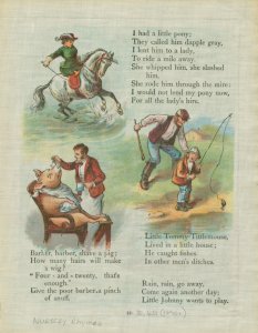
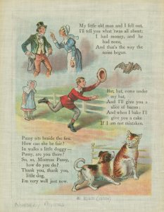
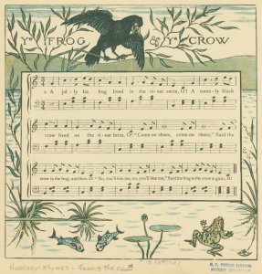
I found all these inexpensive prints, unframed, in a vintage illustrations shop. I thought I'd use a collection over the crib (fitted with acrylic and hard screwed into the wall studs!) and the music sheets would be perfect for the bathroom.


Befores

Here's the bath, with it's odd mirror configuration, 'honey oak' cabinets and Xanadu light. The countertops were fine and the cabinetry was good quality. It just needed a fresh coat of lacquer and new hardware.

The plantation shutters and chocolate brown carpet were brand new, so both had to stay. Since the carpet was 100% wool and a dark color, it was both baby-heathy and baby-proof. The only other stipulation my clients had was that space be "very classic, yet updated, definitely not at all trendy." They also asked me to squeeze whatever I could from the budget to freshen up the bathroom--much needed! (Check out those corner medicine cabinets. I'm dumfounded that such hideous things are mass-produced.)


I got to work proposing, scheduling, sketching and finally ordering. (It always seems so seamlessly easy in a blog post, doesn't it!)


Here's my board


and my sketches


And here are the lovely Afters...


With new hardware, lighting and medicine cabinets (all Restoration Hardware), as well as some white lacquer and fresh wall color, we gave the bath a much need facelift. 


These music book illustrations were much appreciated by the musical father and older brother. More importantly, their parchment background blended with the warm countertop, making a finish I hated look rich and intentional! Love that when you're on a tight budget.


Can't believe that little guy is now brushing his teeth at this very sink. It definitely flies by. All we can do is give them roots and wings, and hopefully a nice little nest they'll always call home.