Showing posts with label cool color combos. Show all posts
Tuesday, April 19, 2011
Sunday, October 24, 2010
Halloween is just around the corner...
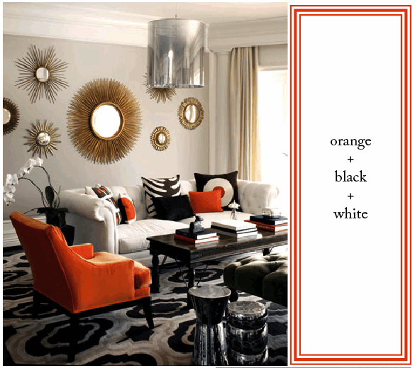
...and so this promises to be my final post on orange + black (or chocolate, or zebra). But I saved my favorite room for last. What a great work of art (especially if you love elephants as much as I do)! Love that green velvet pillow; such an unusual shape. As is the large brass sphere lamp. So many interesting, yet simple, elements -- and they all add up to a strikingly fabulous room.
Sources: modgirl
Sunday, October 17, 2010
Orange + Zebra
I'm still loving the orange + black color combination... and this wild variation on the Halloween theme. Have you got your costume ready?
Sunday, October 3, 2010
Friday, July 16, 2010
Color...
I know, we've all seen these by now, but I'm still swooning? I think after working on a very pale project for a client who prefers to be soothed and swaddled in pastels, these images were like chocolate mousse and foie gras after a long detox diet.
Walls clustered with art, heaps of books, pink chinoiserie,
and strong contrast and juxtaposition everywhere.
'cuz I'd rather be stimulated than soothed any day.
Images: House Beautiful (via thedecorista)
Wednesday, July 14, 2010
The Great Outdoors
First off, I do apologize for the long hiatus! I have been a little MIA. I wish I could say it was basic summer laziness, but the truth is I've been busier than ever! However, this morning I spent sipping my tea and visiting some of my favorite girls. I'm recharged and very inspired.
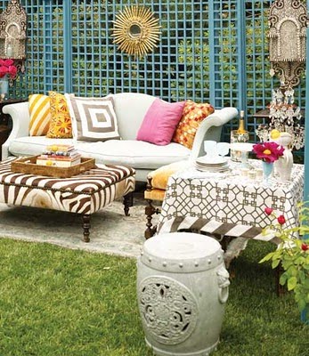
After months of working on other peoples' places, I've finally started to address the outdoor areas of my own home. I know, it's mid-summer, but considering we entertain outside nearly all year here, It's never too late. This week I'll be sharing lots of thoughts on outdoor spaces.
I'm really loving the ethnic inspired, loungey boho chic feel. There are some great outdoor ikats around these days...
Windsor Smith
Veranda
This one above looks like the perfect spot for a margarita party.
Blue and white still feels so cool and fresh...
House Beautiful
I'm finding these two images particularly inspiring, with black and white, boxwood topiaries. Classic yet fun. If only I had room for a tented cabana.
I think I might be headed toward a patio of Black and White. Think I'll start by painting my old navy wicker black...
House and Garden
Stay tuned...
By the way, we're shooting the latest project this week. Can't wait to show you how that Nantucket style house of blues came out. As soon as I get the shots from the photographer, I'll share them with you all.
Sunday, May 2, 2010
Turquoise, White and Gold...
...in any variation is gorgeous. Wouldn't you just love to have cocktails with friends here, followed by an elegant dinner in the perfect outfit.
Kelly Wearstler designed Avalon Hotel
sequined dress $1,920, net-a-porter; clutch, $425, Tiffany and Co.; bracelet, $345, Ben-Amun; earrings $100, Kenneth Jay Lane at Saks; sandals, $7.99, amiclubwear
Breakfast at Tiffany's
Then retire to your suite to sleep 'til noon, thanks to this eye mask and tassle earplugs. If only the rest of my family understood that this is the way I was born to live.
This color combo has been ubiquitous throughout history, as early and the Egyptian and Greeks. It was hugely popular in the 50's and 60's, when Breakfast at Tiffany's was made. Remember the scene where Patricia Neal's scandalous character phones her lover to say she won't be able to meet him as her husband mixes drinks in the foreground. As a young girl I got that this was sort of wrong, but I sure gave her points for her glamorous living room! Check out the white and gold painted credenza with greek key and grecian figures.
dress $925, DVF; clutch Lara Bohinc; sandals $925, farfetch; cuff, $249, CalleenCordero; earrings $295, Alexis Bittar
In this more laid back ensemble, you could knock back a few blue martinis, slouch a little, even chow down a steak dinner (gotta love a roomy, drapey knit). I'd take either outfit, either room, anytime.
Images: Kelly Wearstler; an outfit that would look amazing on moi, styled by moi (and did you happen to catch the $2,000 dress with the $8 shoes?); Paramount Studios; and another outfit for and by you-know-who.
Tuesday, March 23, 2010
Yellow, black and white...I just love it!


I just read a post on my favorite blog of all time, Chinoiserie Chic, about inheriting our parents' design aesthetic. Do we or don't we? It got me thinking about the bold yet traditional approaches my mother's taken over the years, especially about one approach by which I will forever be awed and impressed: her little ode to yellow, black and white. The year was 1972. I know, I look so young, right? It was our first home in a small, uninspiring new development in Northern California. But Bonnie was not daunted by the banality of this neighborhood. She decorated with gusto; and I will say, she knocked it out of the park. There were peacocks and Eames chairs in the living room, cork walls in the dining area... but it was the kitchen/family area that will forever be branded on my brain. She papered the entire kitchen and adjacent family room in a shiny black vinyl that was covered in a white bamboo trellis. Very similar to the one pictured below...
But scattered about every 10-12" over my mother's trellis patterned paper were giant, bold yellow poppies. Tailored white drapes hung in the family room with bright yellow tape at lead edge and along the valance. And over what I'd like to think was a white Saarinen table, was a yellow faux bamboo light fixture. While I can't remember the exact sofa, I know it was black leather with buttons that would catch on my shorts. The whole thing had a very Jonathan Adleresque crispness, along with his sense of humor and fun. Not long ago, after buying Kelly Wearstler's Modern Glamour, I showed these pictures to my mom. She laughed, "Oh my God, it's so 1970's..." We fondly remembered that bright, happy space and in unison we both exclaimed, "I just loved it!"
I just found a woman who really loves this color combo! It's her whole blog.
Images: Kelly Wearstler, blackwhiteyellow.
Friday, February 26, 2010
Ah, Spring!
Sorry, I know many of you are still knee deep in snow. But out here in Los Angeles, it's a breezy 69˚. My only complaint is that my winter wardrobe barely made it out of the closet! You East Coast gals have no idea the fashion boredom we suffer for all this sunny weather. All the things I never got to wear. Only Kate Moss can pull off the Hunter wellies with shorts. Plus this early Spring means early mornings for this light sleeper; newly hatched baby birds do start at the crack of dawn. But if you aren't crying for me yet... it's only February 26th, and I just realized I can't ignore the dirty garden furniture and all the pots to be replanted another minute. Good bye "Winter." Did I mention this also means I need to start thinking about Pilates again...
All this Spring Fever has me craving my favorite color combination: PINK and GREEN. I will forever love my daughter's bedroom, above. To me, it's the quintessential little girl's room. I actually started it the day I learned it was a girl! And I love it as much ten years later.
This morning I came upon a very similar dose of girly freshness via Blair Friedeman at delightbydesign. Blair posted some pictures from San Francisco designer Palmer Weiss' portfolio, which I'm crazy for! I love the crispness of these room and the fresh ladylike palette. Can't you just see Mrs. Weiss' Southern roots?


A final note on pink and green, I happily found this Mary McDonald room from Feb '09 Domino. Don't you just love this "audaciously preppy den"? Talk about crispness. It makes me feel like I'm back in the seventh grade, drooling at the Papagallo store.
This morning I came upon a very similar dose of girly freshness via Blair Friedeman at delightbydesign. Blair posted some pictures from San Francisco designer Palmer Weiss' portfolio, which I'm crazy for! I love the crispness of these room and the fresh ladylike palette. Can't you just see Mrs. Weiss' Southern roots?


A final note on pink and green, I happily found this Mary McDonald room from Feb '09 Domino. Don't you just love this "audaciously preppy den"? Talk about crispness. It makes me feel like I'm back in the seventh grade, drooling at the Papagallo store.
Subscribe to:
Posts (Atom)