Showing posts with label chinoiserie. Show all posts

Saturday, May 28, 2016

Our New Design Offices

I finally found a new space for our offices. It's close to home, the kids' schools, and most importantly, decent lunch spots. It's much smaller than our current space, but we will have actual walls. Now we can all be on the phones without sounding like we're in a call center.

I haven't been able to focus on much else beside the aesthetic of the new space. Green is always my office accent color. But after years with boring gray walls (my mistake!), I want to bump up the drama and paint the walls a rich emerald green.  My cabinet maker is retrofitting our cabinets, including installing these brass library lights with black shades. Of course, because I'm the client, there'll be lots of Empire and Chinoiserie touches, crystal, and gilt. Mercifully, the landlord agreed to let me replace the current 80's fluorescent lights and bad carpet with these crystal fixtures and white wood floors. 

Thursday, July 18, 2013

Her Office...Apple and Apricot

Just playing around with palettes for a new client's office. She loves green, like her designer. I've gone round and round. So many gorgeous options. I thought Green + Orange + Blue, Pink + Green, Green + White... But this morning I'm loving 

Apple + Apricot


These giant paper flowers are most definitely this weekend's fun with my girls. Thank you, God, for my craft-loving daughters!


Possible textiles for client's office. Mary MacDonald's Fretwork linen as a banded roman shade or maybe run it vertically down the desk chair. Quadrille's Zeze in Apricot for guest chairs. Scalamandre Hand painted strié paper (but in solid, not the stripe). And the Mary MacDonald's Chinois Palais panels framed on the back wall. Very fresh, very feminine, very much like my office, where I just realized I've got a little Apple + Apricot + Chinoiserie thing going myself.

One of a pair of 18th C cloisonné ginger jars in my office

Tuesday, December 4, 2012

Design Soulmate-Mark D. Sikes

Ever see a shelter spread and think, "Wait, is that my house?" Whether it's the house of your dreams or your reality. That's exactly how I felt when I saw this Lonny spread. Jennifer at Belclairehouse, felt the same way I did. She called it "decorating soulmates." Behold the work of Mark D. Sikes ...

For months I've had this dining room shot (along with many others of his) on boards behind my desk. I love it more every day. I actually just discovered that I've had much of his work pinned in boards and didn't know it was his. Funny to see the same spaces shot by different photographers, isn't it. Really shows you how crucial light is to the overall essence of a space.

The whole space is filled with all the things I love: Blue and White pottery, French check--especially in camel and cream, chinoiserie, and lots and lots of greenery! A must.

This is exactly how I used to accessorize my giant island in our old house. Blue and white + herb topiaries. (My hurricanes were a ZGallerie steal. I bought out the entire stock.)


Mark D. Sikes Interior Design
Okay, anti-brass client who shall remained unnamed, this shot is bringing my heart back to the polished nickel. Mark is clearly a big fan of Mr. Michael S. Smith, as am I. As is anyone and everyone, I suppose.

Mark D. Sikes Interior Design

And (real-world) friends, doesn't this remind you of my garden? Black and white striped fabrics, boxwoods and white icebergs. Nothing unique, I know. But why reinvent the classics? I think my soulmate Mark D. Sikes would agree.

Friday, October 26, 2012

Brand New England

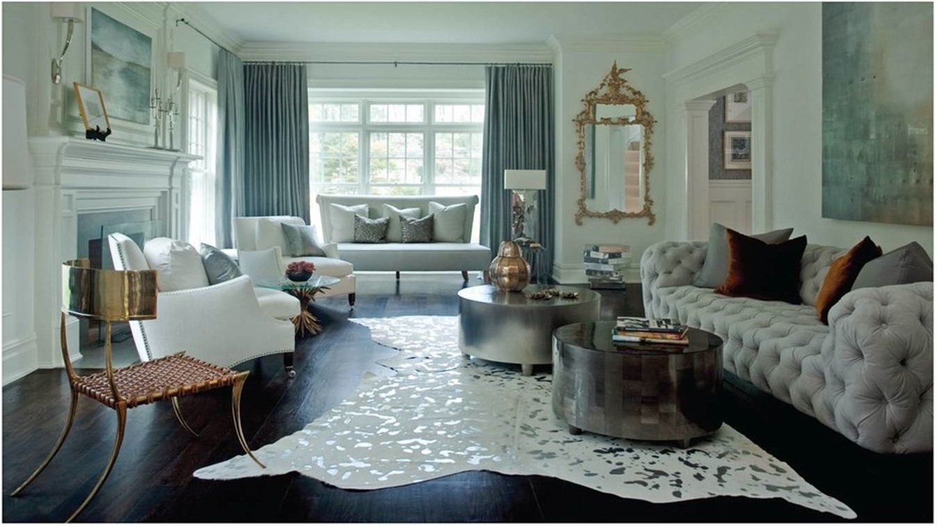
Like everyone else these days, I love New England style homes, whether they're in California beach towns, Napa wine country, or Midwestern plains. But I personally like to blend the clean, classic look with unexpected elements of modern, French or even Baroque. I encourage clients to use salvaged or modern light fixtures here and there, hang a gilded Chinoiserie mirror over a contemporary sideboard  or paint at least some millwork a color other than white (like the teal lacquered library I'm rendering tonight!). Blended, eclectic interiors are so much more expressive, more interesting and, like all spaces done well, age better.

Tonight I happened upon this Interiors spread by Westport designer Lynne Scalo. I was blown over by her super fresh, eclectic take on New England style. I think you will be too.


Happy Weekend!


Sources: Interiors

Saturday, July 14, 2012

Red Uprising

In design school, while studying color theory, we also learned about the so-called psychology of color. One day, while discussing this, our teacher explained all the personality types associated with each color. He then asked us to raise our hands as he went through the colors. "How many of you are Blues?" I, of course, raised my hand. My teacher gave me a look of such horror and disbelief you would've thought I was a mutt traipsing through the kitchen with something half-live between my jaws. "You are so not a Blue," he bellowed.

"Excuse me," I said. "My whole house is blue. My entire bedroom and all my dishes are blue. I'm wearing a blue blazer for God's sake!"


"Yes," he said, "but with a hot pink scarf. Only a Red would do that." I couldn't help but feel offended. I felt loyal, classic, trustworthy. I felt Blue. I always suspected he never really liked me. He even hammered it home, practically calling me out with, "Everything about you screams red." I would've really let him have it, had I not been such a Blue.

He insisted that if I went home and looked through my house and wardrobe I would see that I was, in fact, using blue as a background for all my redness. While I still feel like a blue trapped in a red's psyche, I can now admit what I failed to report back to him: Indeed, my blue rooms were filled with red lamp shades, red Persian rugs, red pillows, hot pink floral arrangements, and mostly red and orange oil paintings. All, as he said, against a blue and beige "backdrop."

Now fashion editors everywhere are hailing the "Spread of Red." I'm a bit surprised because, clearly, red is polarizing. People do seem to love it, hate it, or in some cases, hate loving it. Funny thing is, since this incident so many years ago, I often stop and smile when I catch myself reaching for something in red, or look down at my passengers seat and realize I have subconsciously surrounded myself with (seriously): a red wallet, red key chain, red handbag, and red leather file folder. I didn't buy these things all at once, nor did I think to coordinate any of them. So imagine my surprise to see them all together on the seat of my car; the seat of a car which I'd fantasized about buying...in red. But only an intense, unpredictable, aggressive kind of girl would buy a car like that! And I am so not a Red.


 How about you?

Power red - Christian Dior Fall 2012
Dior, Fall 2012


Michael Kors
Michael Kors

chicken

Chado Ralph Rucci
Chado Ralph Rucci

.

prabal gurung
Prabal Gurung
Giambattista Valli Fall 2011

Azzedine Alaia dress, Jimmy Choo Bale peep toe sandals and Hermes Kelly bag

@dkny pr girl Donna Karan Atelier Collection, 212 872 2863
Donna Karan 2012


so hot

pop of red
J.Crew

.

Giambattista Valli Fall 2011 in red
Giambattista Valli Fall 2011


Friday, September 23, 2011

One (bargain) Blue and White Fabric--Three Ways

Thought I'd share this great look-for-less find. I found this beautiful (and crazy affordable) Blue and White Chinoiserie toile. It's rather "'inspired" by Quadrille's Lyford Pagoda Petite. But I have to say I like it almost as much as the original. I haven't seen it in person but I'm going to take a chance and order some samples. Not exactly a huge risk; it's $19/yard! I was so excited I put together three different mood boards in three different color schemes. 

The first is a scheme I've really been missing lately: red, white and blue.

I wanted to avoid the expected, so rather than using a Victorian upholstered headboard, regency fixtures and faux bamboo furniture, I went for a more masculine, clean metropolitan feel. And I kinda like it. Okay, so I threw in an orchid.


Here's a board in my favorite new color crush, blush and navy. (And, yes there's faux bamboo and Regency gold.) It's kept fresh with lots of block-printed fabrics and tropical greenery, balancing the delicate, gilded touches. It has sort of a romantic Indo-Chinois feel. I imagine this is how I'd style the French Indochine set for Marguerite Duras' "The Lover." (If I were the type to sit around and imagine that sort of thing...)


Navy blue with burnt orange, is a classic complimentary scheme. Here's a board for a guest bedroom which incorporates very traditional furnishings with the wit of a Billy Baldwin-esque side chair and a graphic rug. Lots of brass, warm woods and leather, like the Hermès Pippa console (pear wood with brass fittings--stunning!) Feels like a perfect place for tired guests to relax after a long day of riding. Or for your mother-in-law to crash after Thanksgiving dinner.

Email me for other sources or if you're interested in our e-decorating services.

Happy Friday!

Thursday, September 1, 2011

Navy + Pink Master Suite

File under color crush. This combination is tempting me everywhere I turn. I'm dying to do a master suite in navy and pink. I'd even feel satisfied with cobalt and blush. If I can't convice any clients to take it on, this cool color combo just might end up in my own home--like so many of my creative incarnations.

Hopefully, my man doesn't have a problem with a pink master bedroom. I think it's super strong, yet sexy; the perfect combination of yin and yang. And isn't that what the bedroom's all about? 

Check out my full inspiration board.


Lily Pulitzer showroom via Effortless Style
I love dark cobalt walls like these snapped by Camila at the show earlier this year.
 Just so afraid after a while they'd feel, well, dark.

I'd more likely go with coral pink walls and work in the navy and white. I've been drooling over this Mary McDonald image forever. I love the black and fruitwood console, the mix of deep navy prints and the shameless pink on pink.

Lily Pulitzer Showroom

 I'd add personality with lots of vintage modern details, like this metallic leather lamb (1stDibs) and a great gallery wall to keep it from going too traditional or feminine. Maybe a great graphic rug.


...and Quadrille fabrics galore.


I am manufacturing a similar velvet settee with a bench cushion. Look for it on our new site. (Ah, the to-do list...) It's the perfect shade of royal navy.

 If I get any gift in the next year, I want it to be this chair!

Sources: Inspiration board Alexandra Rae pinterest; second image via Kelley Moore; Lily Pulitzer showroom, High-Heeled Foot in the Door ; Mary McDonald room, Chinoiserie Chic; sputnik chandelier, littlegreennotebook; sheep, 1stdibs.com; pagoda mirror, Pieces; blue and white elephant, My Pinterest Board; chair, Pieces